

Commodity ETFs: Brand update and extension
Teucrium
Expanding an established ETF brand into a flexible system for market clarity.
Project purpose and scope
Teucrium needed a brand system that could support more than recognition. As the firm expanded its ETF platform and investor education efforts, the visual identity needed to communicate access, transparency, and confidence across a broader range of materials.
The work extended an existing brand into a more complete system for digital campaigns, product collateral, market insight, and advisor-facing communications.
The project was awarded Silver — B2B Branding: Visual Identity System in the 2026 Financial Communications Society Portfolio Awards.


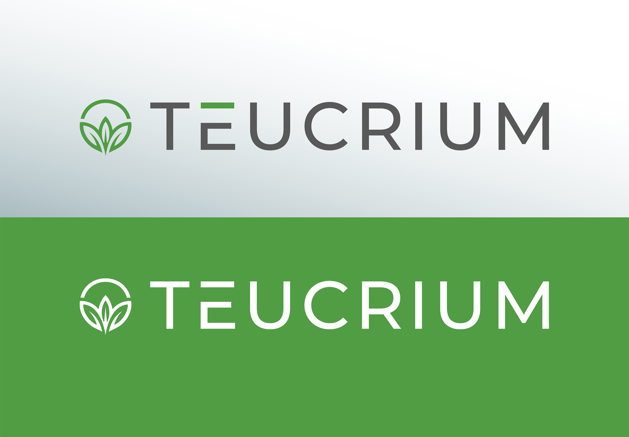
Logo evolution
The Teucrium logo was not redesigned. It was preserved as the foundation of the expanded identity system, maintaining the equity already built into the inherited mark and logotype. The work focused on giving the logo a clearer role within a larger brand environment, with standards for spacing, scale, color, contrast, and usage.
This allowed the existing identity to feel more current and consistent without losing the recognition and continuity already associated with the brand.

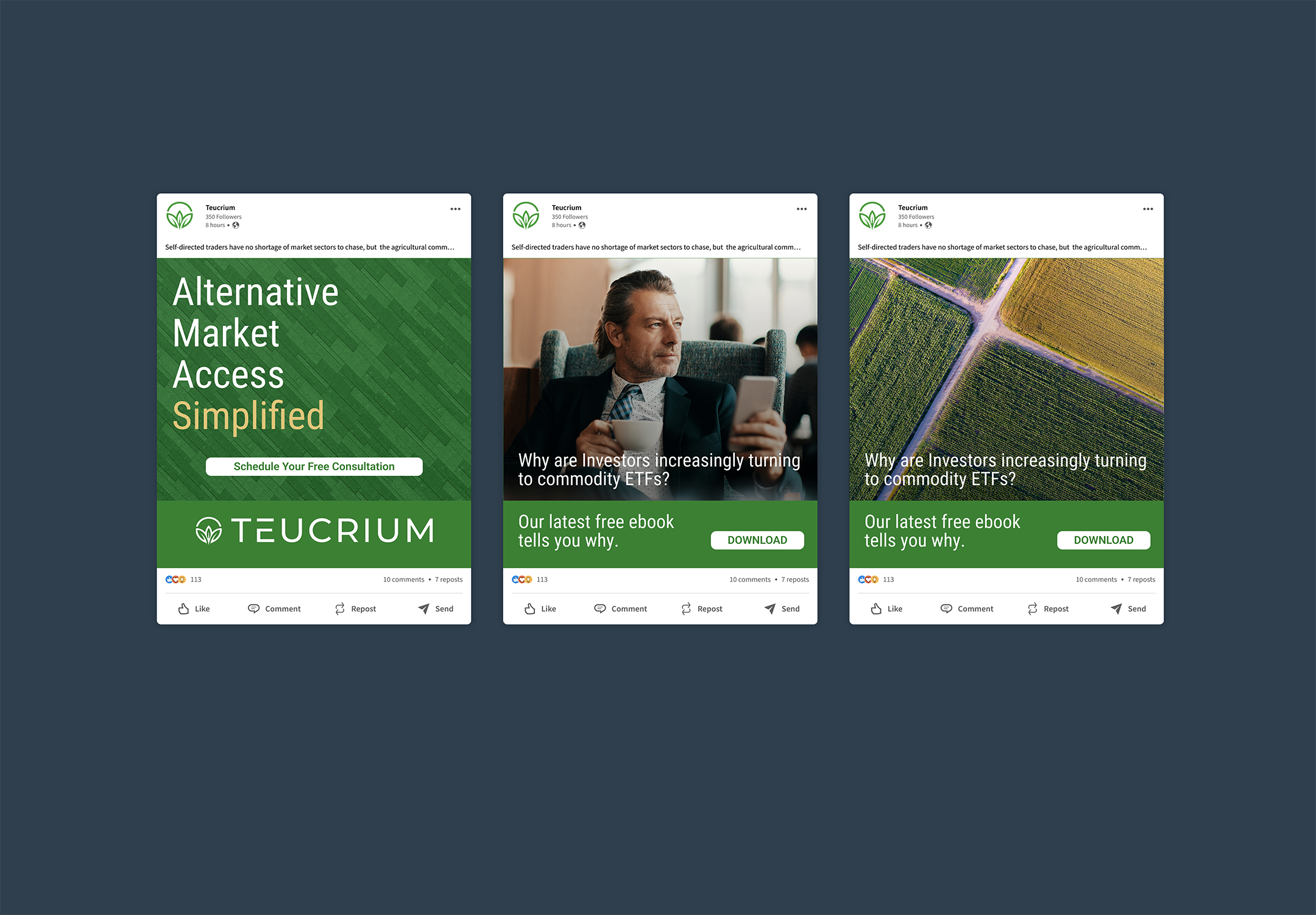
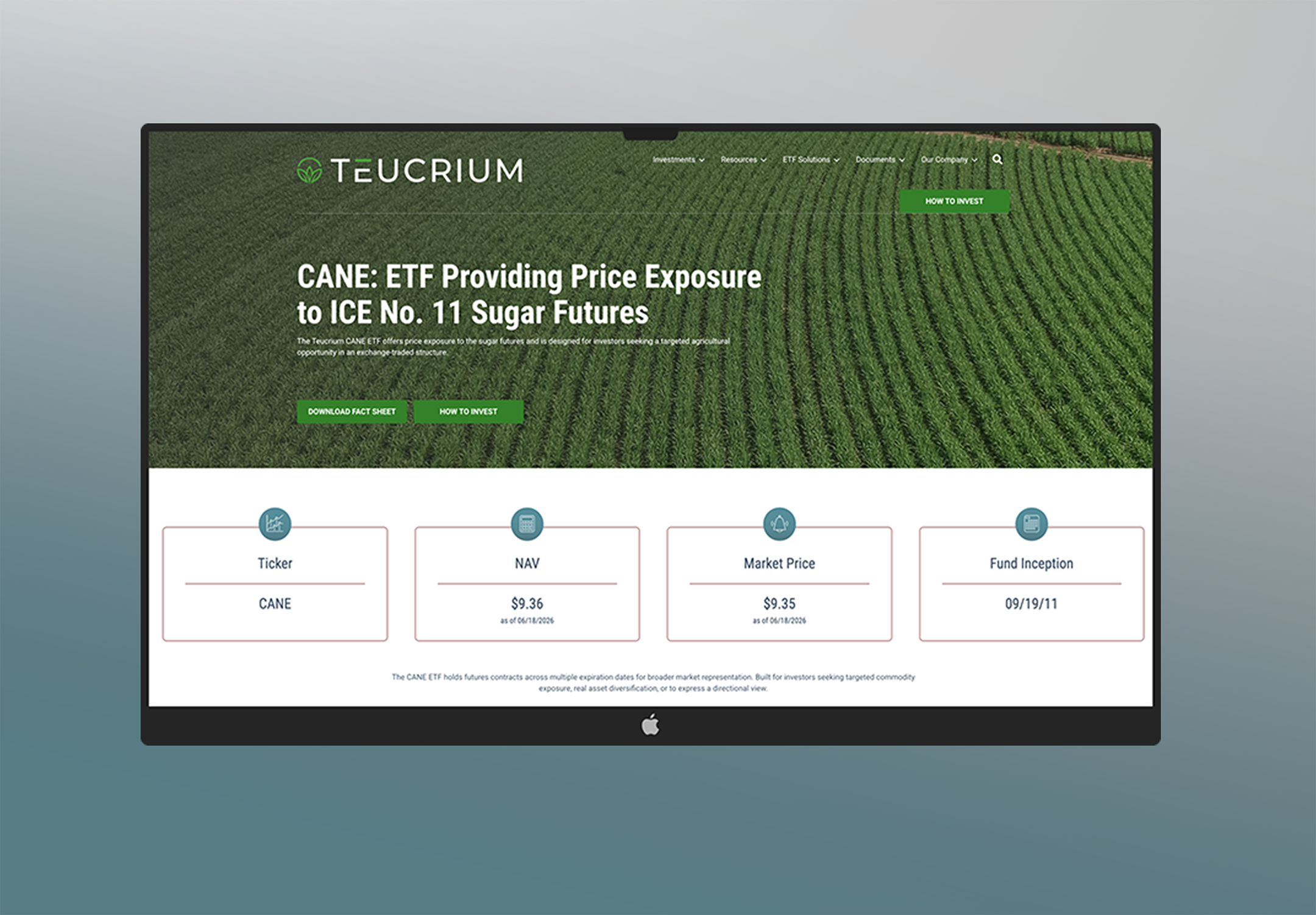
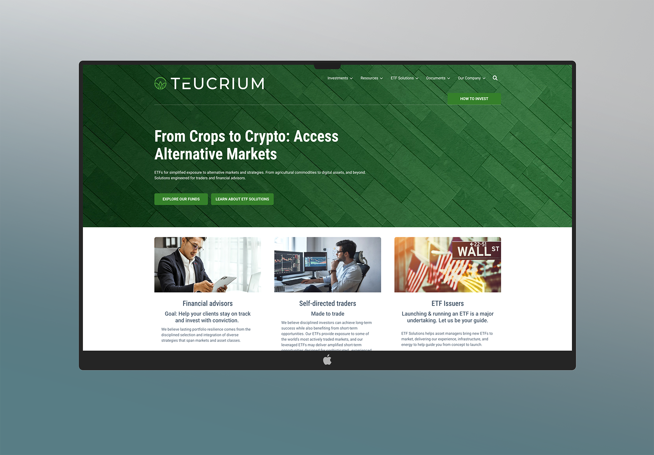
Print and digital applications
The expanded system was designed to perform across the materials Teucrium uses most: print collateral, product education, digital marketing, web experiences, and social content.
In print, the brand provides structure for complex financial ideas through clear hierarchy, disciplined pacing, and flexible graphic elements. In digital, the same system becomes modular and scannable, helping market concepts, ETF positioning, and investor education feel connected across touchpoints.


Expanded brand foundation
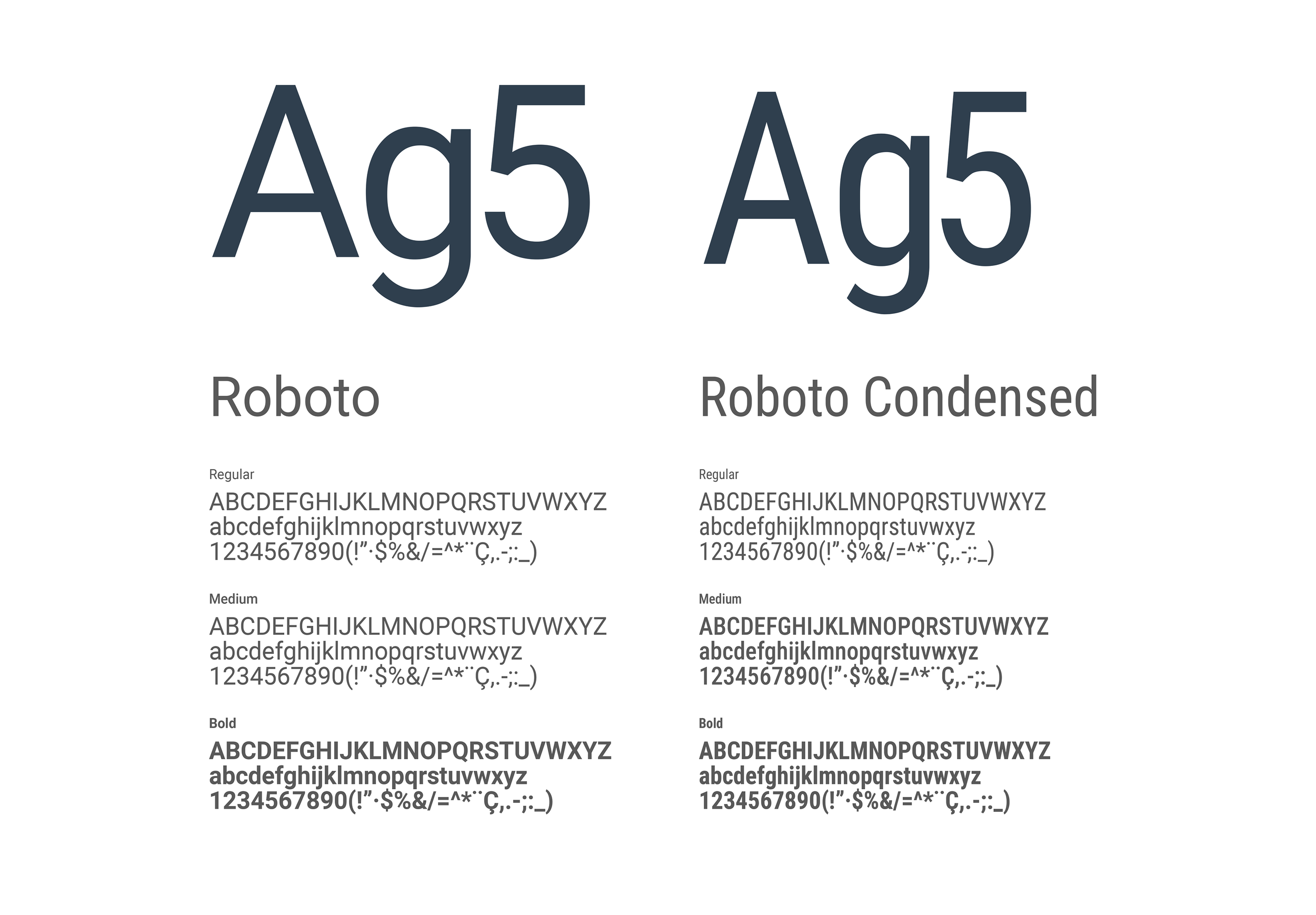
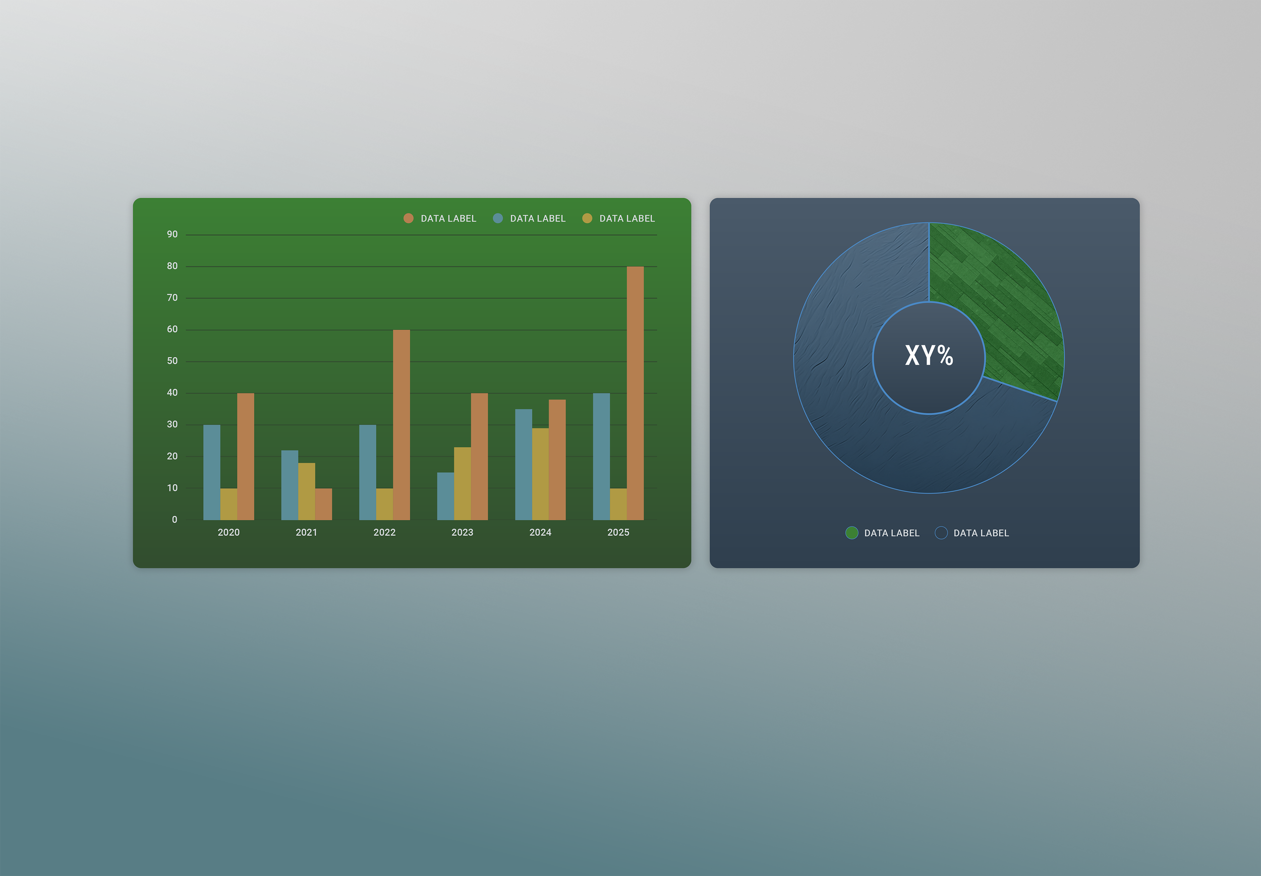
The brand guide established the practical tools needed to make the system repeatable. Typography, imagery, color, data visualization, and digital standards were developed to work together, not as isolated design choices. Roboto and Roboto Condensed provide a clear typographic foundation.
The expanded palette adds range for storytelling, analysis, and data. Photography, textures, and graphic elements give the brand depth while keeping the overall system focused, professional, and easy to apply.