

Fund Services: Brand, website, collateral
ETF Solutions
A purpose-built brand grounded in precision, navigation, and visual clarity.


ETF Solutions by Teucrium provides tailored ETF creation and management services to asset managers and advisors.
I partnered with their team to design a bold, versatile brand identity that reflects their role as a trusted guide in a complex industry—anchored by the concept of The Navigator. The work included strategic direction, logo design, typography, color palette, data styling, and digital applications.


The Brand Strategy: The Navigator
The brand is rooted in the idea of The Navigator—a guide who brings clarity and direction to the ETF journey. This concept informed every creative decision and aligned the visual identity with the firm's mission to lead with confidence.
Logo and Compass Icon
The stylized compass mark captures the brand’s essence: precision, trust, and forward momentum. It’s supported by a clean logotype that balances professionalism with approachability.
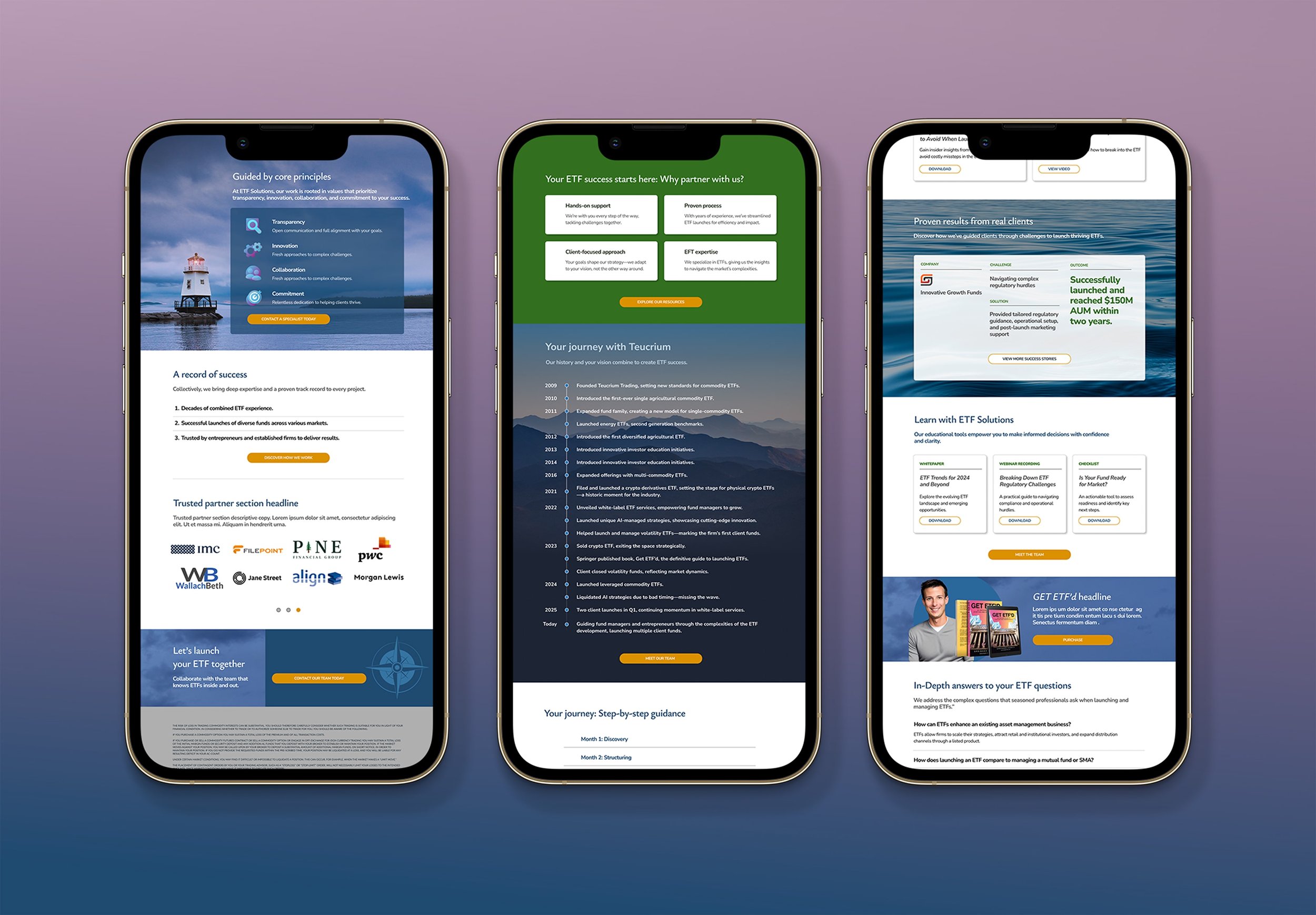
Photography Direction
The brand’s imagery draws from natural elements—water, night skies, and landscapes—to reflect clarity, confidence, and guided exploration. The hero image, showing the light beacon in Burlington, Vermont harbor, grounds the brand in its home city and symbolizes its role as a steady guide in the ETF space.


Web and Social Templates
Digital applications followed a 12-column grid system and modular scale typography. I also created branded templates for LinkedIn and other digital touchpoints to ensure visual consistency.
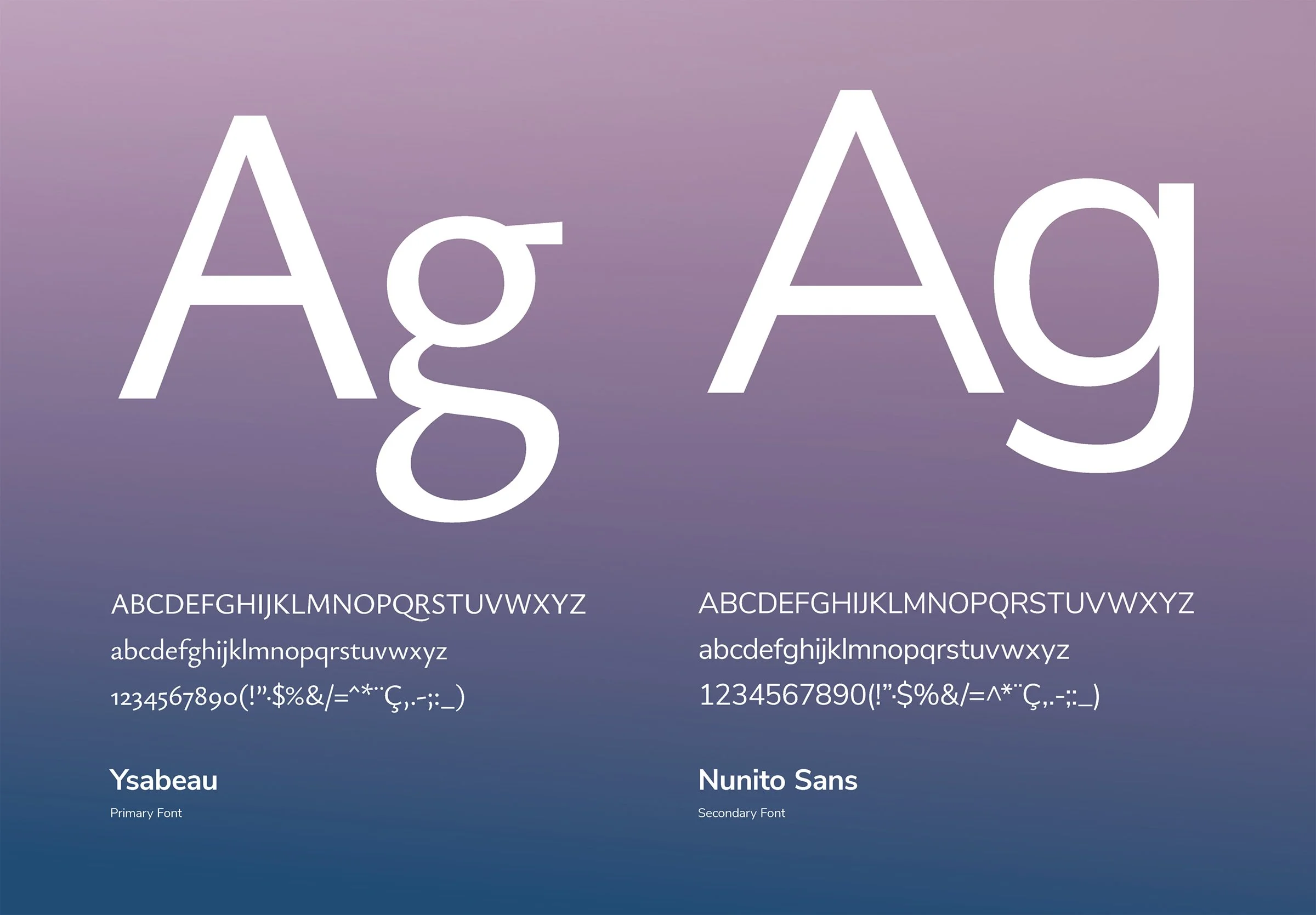
Typography System
The type hierarchy uses Ysabeau and Nunito Sans to convey strength and clarity. Headlines speak with authority, while body copy remains highly readable across print and digital platforms.
Color Palette and Accessibility
A deep, confident blue anchors the brand, complemented by a range of secondary and accent colors that meet WCAG accessibility standards and adapt well across media.


